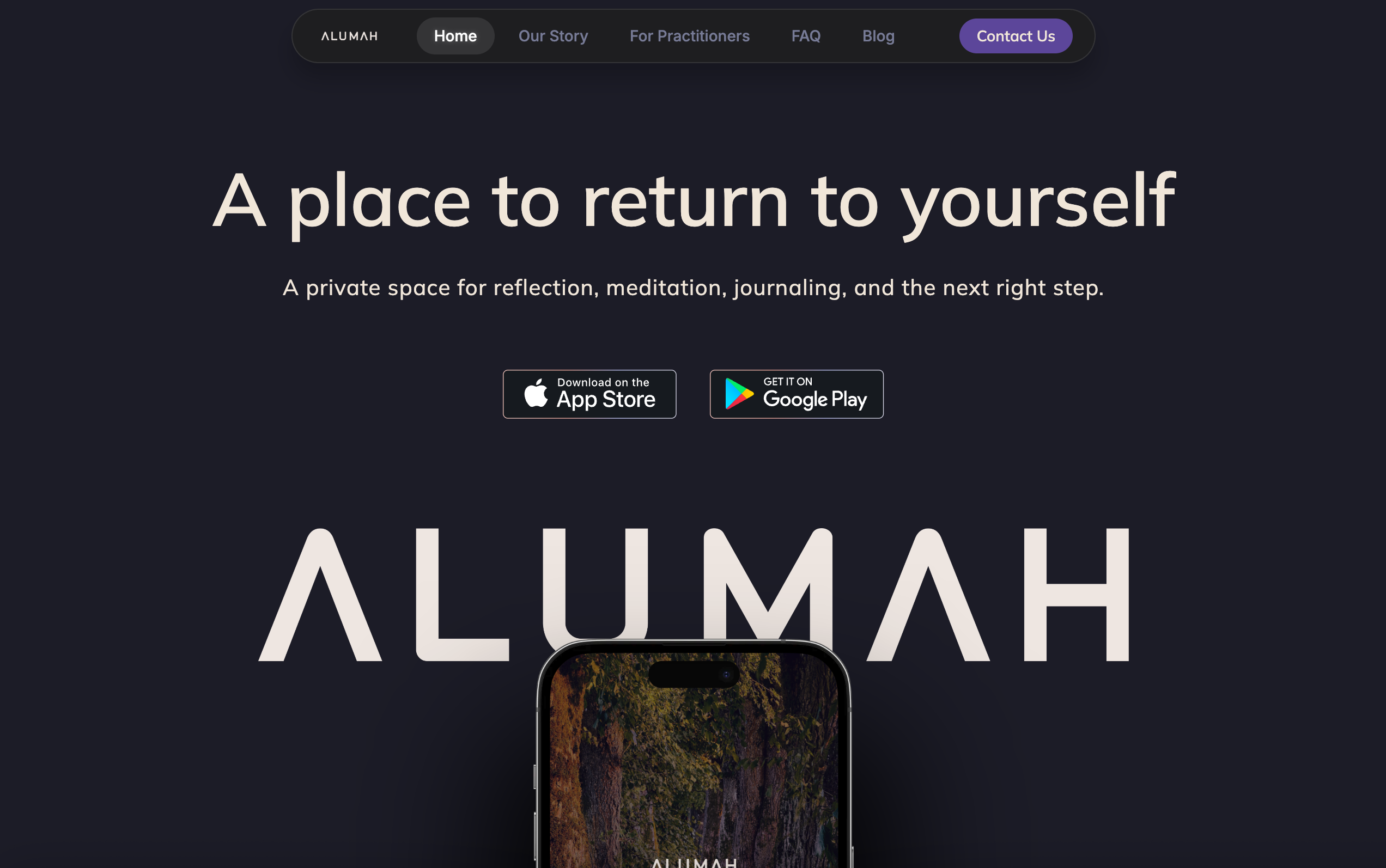
When Katie came to me, she was frustrated with another agency’s attempt at the website. A non-negotiable for Alumah was a website that felt like a seamless extension of the app – a welcoming, safe space for all. Instead, the initial website felt like that of a religious organization or a nursing home.
Alumah was preparing to launch their app in the winter of 2026, and they needed to put their best foot forward as the company began meeting with organizations and individuals who would become long-term partners of the brand. They wanted a design partner who was embedded in their brand's vision and ethos. Someone who understood the app's goal, positioning, and mission. Someone who would take their ideas to the next level.
Luckily, my strengths as a brand and web designer lie in understanding the vision and pushing the concept even further, not just delivering surface-level results.
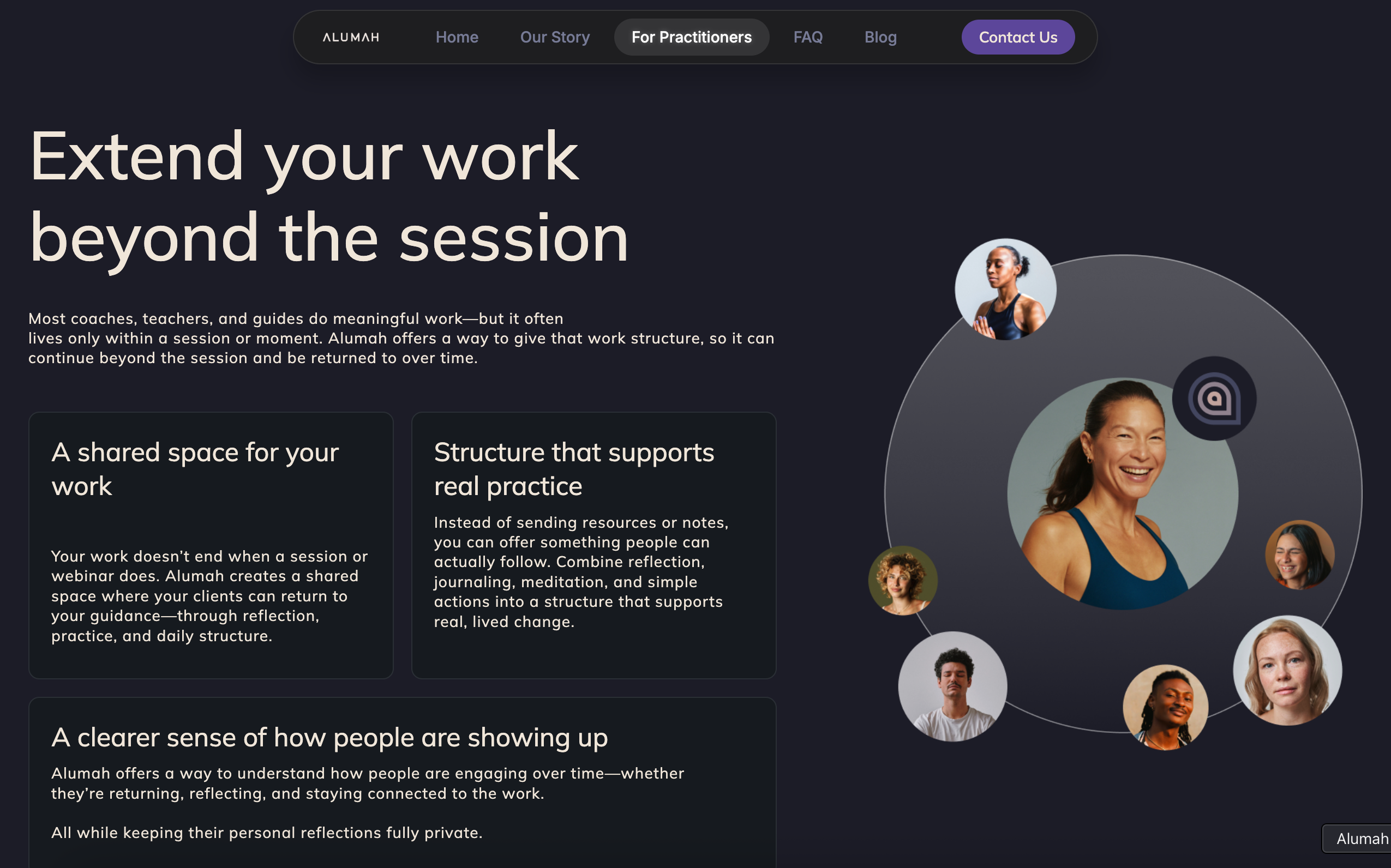
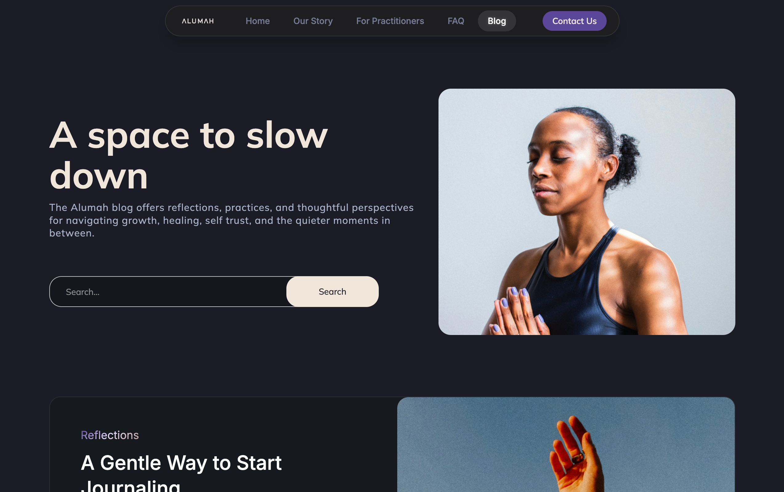
Instead, I took the words that kept coming up in meetings – calm, trustworthy, credible, at peace, guided, welcoming – and turned them into a website that felt like all of those things and more. The result was a web presence that matched the intentionality they put behind their platform.
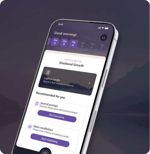
We mimicked the feel of the application to the website so it felt like a seamless experience for users. Colors and typography were chosen to feel calm and safe, but also motivating, modern, and elevated. This aligned with their vision of standing with some of the bigger-name apps while still feeling trustworthy (which is very important for a brand dedicated to protecting the privacy of their users so that they feel like their innermost thoughts are safe).
Some of my favorite parts of the site, as the web designer, were the custom animations and dynamic interactions. They make the site, and by extension, the app, feel powerful. The call-to-action section above the footer was also a must. I love the compartments and the animated app favicon that serves both as a signup tool and a powerful design element.



Working with Monica was absolutely amazing. She has such a talent for taking your vision and turning it into something beautiful.
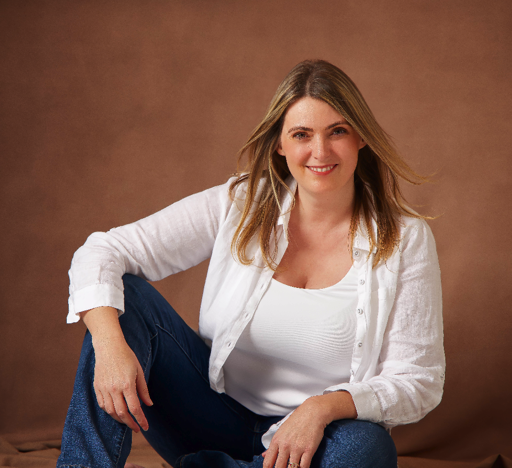
Working with Madera was a dream. Their attention to detail and ability to seamlessly integrate our ideas into the project exceeded our expectations. We couldn't be happier with the end result.

Working with Madera was a dream. Their attention to detail and ability to seamlessly integrate our ideas into the project exceeded our expectations. We couldn't be happier with the end result.
Working with Madera was a dream. Their attention to detail and ability to seamlessly integrate our ideas into the project exceeded our expectations. We couldn't be happier with the end result.
Working with Madera was a dream. Their attention to detail and ability to seamlessly integrate our ideas into the project exceeded our expectations. We couldn't be happier with the end result.